
Main menu
You are here
Working with model diagrams : Customizing the diagram's appearance
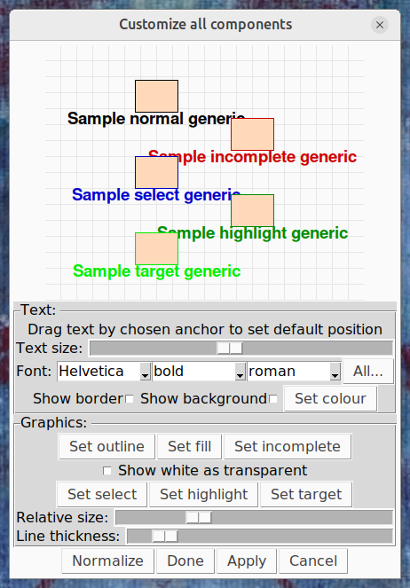
The "View -> Customize" menu selections display a dialogue that allows you to customize almost any aspect of the model diagram. You can change the appearance of just one type of component, or all components at once. The dialogue displays an example of how the component (a compartment if customizing all components) will look after any changes are applied.
Text panel
This panel is displayed only when customizing a item type that has a caption, or the text box item type, or all item types at once.
Default caption offset and anchor
In this display, dragging the caption will set the relative position in which it appears to the component by default. This setting is overridden when dragging the captions of individual components on the diagram. The caption can be dragged by any of nine 'anchors' -- the four corners, the middles of the four sides, and the centre. Dragging the caption by an anchor sets the point that will remain the same when the text is changed; e.g., if it has been dragged by the top anchor, then adding new lines to the caption will cause it to be extended downwards.
Size and font
A horizontal slider allows the relative size of the text (relative, that is, to the scaling applied in whichever submodel the component is in) to be set. Below that, three drop-down menu buttons allow the font family, weight and slant to be set. Not all combinations of these are available on any given machine, and in the case that the desired combination cannot be displayed, a close approximation will be selected. The "All..." button to the right of these opens a separate dialogue from which any font available on the system can be selected.
Bounding box and colour
Text can be displayed with a bounding box, to allow it to show against a similarly coloured background and to make it easier to click on in a cluttered screen. The border and background of this box can be turned on and off with the appropriate checkbuttons in this panel. The border is the same colour as the text; the background is some other colour chosen to contrast with this. The "Set colour" button displays a dialogue which allows the default colour of the captions to be changed, although if a component is incomplete, selected or highlit, the caption will always be the same colour as the component's outline. When you hover over this button, it turns the currently selected colour.
Graphics panel
The graphics panel is displayed when customizing any item type except the text box, or all item types at once.
Colours
Items (except role arrows, influences and submodels, which have no fill) are drawn on the diagram using two colours, the outline and the fill. The fill colour is always the same, and can be set with the "Set fill" button. The outline colour depends on whether the component is incomplete, selected or highlit. "Set outline" sets the colour that applies if none of these are the case, and the other buttons set the colour for each of these cases. "Highlight" is the colour of a link between a selected and an unselected component, and "target" is the colour of a ghost when its base is selected, or vice versa, or a component highlit as a result of the highlighting choices in the View menu. All these buttons turn the currently selected colour when hovered over.
The colour used in a particular circumstance can be set to transparent. Any component or part of a component displayed as transparent will be invisible. A useful trick for very complex diagrams is to set the outline colour for influences to transparent. This prevents them appearing at all unless a component they connect to is selected.
Size and thickness
These sliders alter the size and thickness of each component type. Size is interpreted differently for some components; for a submodel it means the radius of the corner arcs, while for a link it sets the relative size of its arrowhead and 'blob' at the start, as well as the bowtie for flows.
Action buttons
This dialogue has four action buttons at the bottom:
- Normalize: reload the dialogue settings with Simile's defaults
- Done: Apply any changes to the diagram and quit the dialogue
- Apply: Apply any changes to the diagram and keep the dialogue open
- Cancel: Close the dialogue, ignoring any changes that were made since the last 'apply'.
If a model is saved after its appearance has been customized, the customization settings will be saved with it and restored when it is reopened, provided "Save models as canvas file" is selected on the Save tab of the Preferences dialogue. Otherwise no custoization will be saved and the model will have the default appearance when reopened.
In: Contents >> Working with model diagrams