Step-by-step tutorials
We present a number of step-by-step tutorials to help you get to know the Simile visual modelling environment.
The first tutorial introduces you to basic Simile techniques. You should work through it before trying the others, since they generally assume that you have done this. The remaining tutorials can be tackled in any order, depending on your interests.
| Name | Description | Author | Level | Simile topics | |
|---|---|---|---|---|---|
| Bank account | Introduction to basic operations involved in building and running a Simile model | Robert Muetzelfeldt | 0 | Editing model diagram Building the model Setting up output displays Running the model Saving and loading models |
English Espanol |
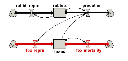
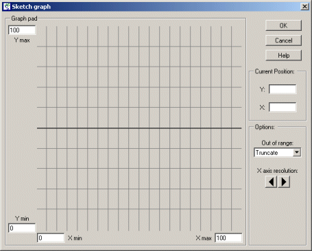
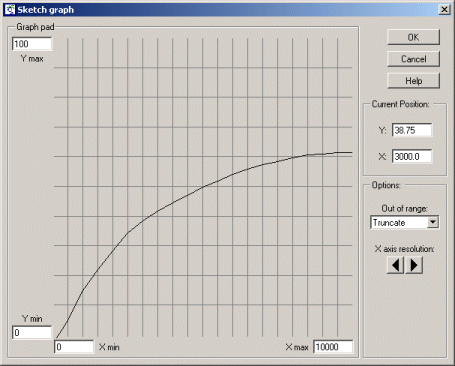
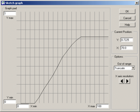
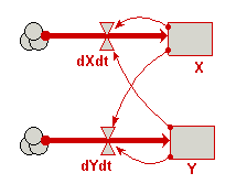
| Predator-prey | Classic model of predator-prey dynamics, with some modifications to improve biological realism | Robert Muetzelfeldt | 1 | Multiple-compartment models Sketch-graph relationships |
English |
| Trees | Individual-based modelling of the growth and population dynamics of a stand of trees | Robert Muetzelfeldt | 1 | Working with submodels Population submodel Customised displays |
English |


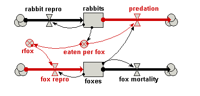
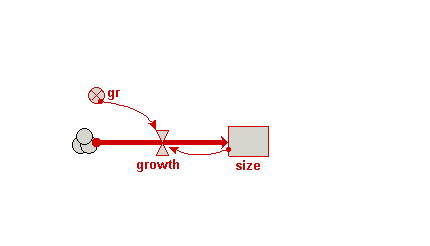


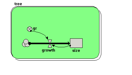


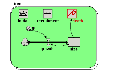
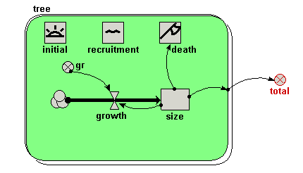
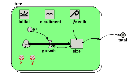
Your model diagram should now look like this: